New ADA Title II rules require WCAG 2.1 AA by 2026–27. Learn 5 high-impact fixes for websites & training, plus vendor questions for libraries/nonprofits.
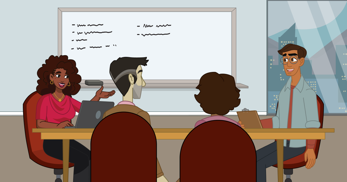
Have you ever been frustrated when a website is down, a form doesn’t work, or site navigation isn’t clear?
You click a button, and nothing happens. You get an error message that doesn’t explain what went wrong. A video autoplays, and you can’t find the volume adjustment. Technically, everything is “working”—just not for you.
For many people, these kinds of challenges aren’t just an occasional annoyance—they’re a daily reality. Digital accessibility comes down to one basic question: Can everyone use this?
In this article, we’ll go through what accessibility means and how you can make your website and training materials more accessible. We’ll cover:
- What is digital accessibility?
- New accessibility regulations
- Five high-impact fixes for your website and training
- How to make accessibility part of your process
- Where to start
- What to look for in a training platform
- Bringing it all together
What is Digital Accessibility?
We chatted with Westyn Drake, our software engineer here at Niche Academy, who’s been working hard to ensure our platform is compliant. Inspired by Rob Carr of WebAIM, Westyn explained:
The most basic definition involves people being able to know "what is this thing? What does it do?" and then being able to actually interact with it.
Accessibility ensures access for people with visual, auditory, motor, and cognitive disabilities. Some have visual disabilities like low vision or blindness. Others have auditory disabilities, such as partial or complete hearing loss. Some have motor disabilities that make using a mouse or precise touch gestures difficult or impossible. Others have cognitive or learning disabilities that affect memory, focus, processing speed, or reading.
In the U.S., roughly one in four adults has a disability. That means digital accessibility is a core part of serving your community. And it doesn’t just apply to your website—it applies to all your digital content. Online forms, downloadable PDFs, online training modules, orientation videos; if any piece isn’t accessible, the experience can break down for someone.
We’ll discuss websites and training materials together.
New Accessibility Regulations
The one argument for accessibility that doesn’t get made nearly often enough is how extraordinarily better it makes some people’s lives. How many opportunities do we have to dramatically improve people’s lives just by doing our job a little better? - Steve Krug
There are two big reasons accessibility is getting more attention (and pressure) lately: people and policy.
The People Side
If you work in a library or nonprofit, you’re already in the business of equity and inclusion. Digital accessibility is simply that mission expressed online.
When your digital spaces are accessible, people with disabilities can participate fully instead of having to work around you. But accessibility doesn’t only help disabled users. A better structure, clearer language, image captions, and more predictable layouts make things easier for everyone.
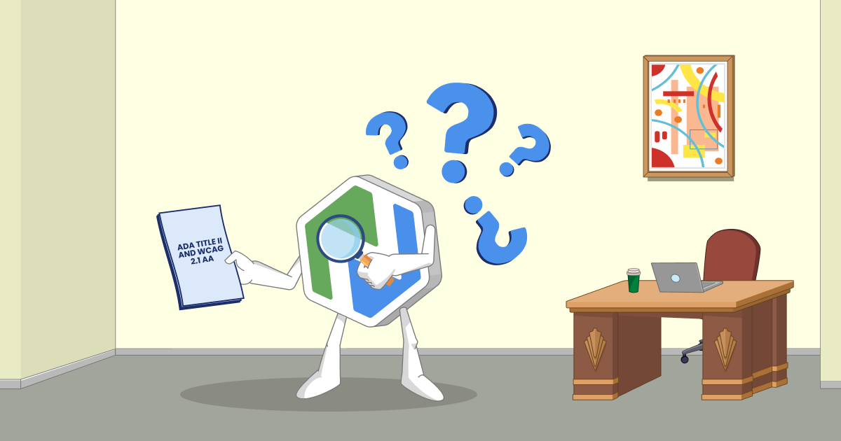
The policy side: new accessibility regulations
(or ADA Title II and WCAG 2.1 AA in plain language)
Accessibility isn’t just nice to have—it’s the law.
In April 2024, the U.S. Department of Justice finalized new rules under Title II of the Americans with Disabilities Act (ADA) to clarify how state and local governments must make their websites and mobile apps accessible for people with disabilities. That includes public libraries and many other local agencies. Larger public entities generally have until April 26, 2026, and smaller ones (defined as serving populations of less than 50,000) until April 26, 2027, to comply.
The rules point to WCAG 2.1 Level AA as the standard. WCAG (Web Content Accessibility Guidelines) is essentially a detailed rulebook for digital accessibility, and focuses on four principles:
- Perceivable: people must be able to perceive and understand information using only one of their senses.
- Operable: all webpage elements must be operable to someone using assistive technology like a screen reader or voice control.
- Understandable: users must be able to understand all the content and functions on a web page.
- Robust: webpages must be robust, that is, able to communicate with all learners while adapting to evolving technology and needs.
WACG itself isn’t a law, but complying with the ADA means meeting WCAG standards for things like:
- Websites
- Web and mobile apps
- Online documents like PDFs and spreadsheets
- Online forms
- Cloud Services and SaaS
- Educational technology
- Videos
And more. As Accessibility Works states: “Essentially, if a state or local government entity offers it digitally, it needs to meet local government digital accessibility standards.”
All this might feel like a lot, but remember, what you need is to make steady, meaningful progress. Let’s focus on a few high-impact changes that you can make.
Five High-Impact Accessibility Fixes for Your Website and Your Training
Everything you do to make your website accessible, you should also do to make your training material accessible. Unfortunately, many organizations think of accessibility as an add-on—something done after you design a website or training material. Instead, think of it as a lens to use throughout the design process, from the start.
WCAG has dozens of detailed requirements that are incredibly useful for auditors and professional developers. But it can be overwhelming if you’re just wondering, “How can I make sure this training piece is accessible?”
Here are five key areas to consider.
1. Make Your Content Easy to See and Hear
First, look at how your information shows up to people.
Ask yourself, “Could someone with low vision, color blindness, or hearing loss use this comfortably?”
Color
Check for strong contrast between foreground and background elements to ensure users can clearly see and understand information on a page.
And make sure none of the information completely depends on color to make sense. According to the University of Washington, “When color is the only cue used to convey information, users who can’t perceive those color differences may miss important details altogether. Someone who is blind won’t know that ‘errors are in red.’ Someone with color blindness may not be able to distinguish a red line from a green one in a chart.”
You may have to darken text so it stands out against a light background. Or you might need to add an asterisk to a red label to indicate required fields in a form.
TIP: Use WebAIM’s contrast checker to ensure your color combinations have enough contrast.
Audio and Video
Include captions and transcripts with audio and video content. They support people who are deaf or hard of hearing—and they also help anyone listening in a noisy environment, a quiet office, or with low bandwidth. If you’re overwhelmed by the idea of captioning everything, start with your most-used training videos and public-facing content that gets the most traffic.
You should also add controls to videos so people can easily pause, rewind, or change the playback speed. WebAIM is a good resource for more in-depth guidance on adding captions, transcripts, and audio descriptions.
Tip: Avoid using loud audio or rapidly flashing content. They don’t provide a great experience for anyone and can have negative effects on some.
2. Make It Easy to Navigate—Even Without a Mouse
Next, think about how people move through your site or training. Many users rely on keyboard navigation or assistive technology. If you build pages like a maze with no map, these users are at a real disadvantage.
A good place to start is with headings. Use meaningful headings and subheadings in a logical order (H1, H2, H3), so someone scanning the page can quickly understand how to find information. Headings are also how screen readers make sense of the structure.
Try testing your site or a training module using only the keyboard. Set your mouse aside and see if you can tab through links and form fields in a sensible sequence. Can you get where you need to go? Or do you bounce around unpredictably? While you’re there, notice whether there’s an easy way to skip past repetitive navigation and get to the main content. Small touches like a “skip to main content” link can make a big difference.
Consistency also matters. When your navigation and key actions live in familiar places from page to page, people don’t have to re-learn how to use your site on every click.
TIP: UC Berkeley has a helpful online resource about headings and how screen readers “see” information.
3. Make Your Content Understandable at a Glance
Accessibility isn’t just about code. It’s also about how you write and design your content. Let’s look at some simple changes that have a big impact:
- Buttons and links: Use more descriptive text for buttons and links. Instead of “click here” or “read more,” link the meaningful words: “Download the volunteer handbook (PDF)” or “Register for the parenting workshop.” These details help screen reader users and make scanning easier for everyone.
- Forms: Add clear labels to fields and helpful error messages when something goes wrong. Be clear when information is missing, and add a confirmation when the form is submitted successfully—these steps can dramatically reduce confusion. Also, make sure forms don’t time out. People using screen readers or those with cognitive disabilities may need more time to complete the information. The World Wide Web Consortium (W3C) provides additional guidelines about forms.
- Layout: Give your content some breathing room. Break longer sections into shorter paragraphs with clear headings. Avoid packing too many competing elements onto one screen. White space isn’t wasted space; it’s what lets people actually see what matters.
4. Make Media and Documents Friendly to Assistive Technology
Training content and public documents are often where accessibility can quickly become a challenge. An attractive layout doesn’t do any good if crucial text is in an image that a screen reader can’t access.
Images
If you use images in your training or on your website, be sure to add alt text that briefly describes the image's purpose. You don’t have to describe every pixel, just what matters for the content. “Patron using the library’s curbside pickup service” is far more helpful than “Image123.jpg.”
TIP: If your image is simply decorative and doesn’t add meaning, add two double quotes ("") for the alt text—this will tell the screen reader to skip it entirely. Screen readers are not fast, so skipping over non-essential information is helpful.
Documents
When you’re creating documents like Word docs or PDFs, try to use actual text rather than images of text, and use built-in heading and list styles instead of manually formatting everything.
Tip: Columbia University outlines clear steps for making documents accessible.
5. Give People a Way to Tell You When Something Doesn’t Work
Even with the best intentions, you’re going to miss something. The important thing is to make it easy for people to tell you when something is broken and to show that you take those reports seriously.
A simple way to do this is to add an accessibility link in your website footer and in your training hub that explains how someone can report a problem. It could be a short form or a dedicated email address—an easy way for them to explain what they were trying to do and what got in the way.
Behind the scenes, decide who will monitor submissions and how quickly they should respond.
Additional Guidance
Looking for additional guidance? Download our Accessibility Checklist.

Make Accessibility Part of Your Process
Accessibility works best when it’s a normal part of how you create content—not an emergency cleanup project when something goes wrong or a deadline looms.
How do you make that shift without adding a whole new job description to your plate?
Write It Down
Start with a short, plain-language accessibility statement on your website. It doesn’t need to be long or perfect. It simply needs to state that you’re committed to digital accessibility, that you’re working toward established standards like WCAG 2.1 AA, and that you welcome feedback, with a clear way to submit it.
Internally, a basic accessibility policy or checklist gives staff and volunteers something to work from. It might be as simple as “always add alt text,” “run the built-in accessibility checker before publishing,” and “avoid color combinations we know are hard to read.” You can refine it over time.
TIP: Create a branding book (or update your existing brand book) that outlines colors, fonts, and other important accessibility features.
Audit Smartly (without getting lost in the weeds)
Auditing for accessibility doesn’t have to be a huge undertaking.
Automated tools are good at scanning your site for issues like missing alt text, low contrast, or unlabeled form fields. Running those scans on your main site and training portal a few times a year helps you catch low-hanging fruit.
Automated tools are a great way to get started, but remember, they can’t tell you whether your content makes sense or your navigation feels intuitive. That’s where real people come in. If you can, invite staff or community members who use screen readers or keyboard-only navigation to try completing a few common tasks and tell you where they get stuck. If that’s not possible, even having staff simulate different scenarios can uncover problems.
The key is to prioritize. Focus your time on high-traffic pages and important tasks like signing up for a program, applying for services, or completing mandatory training.
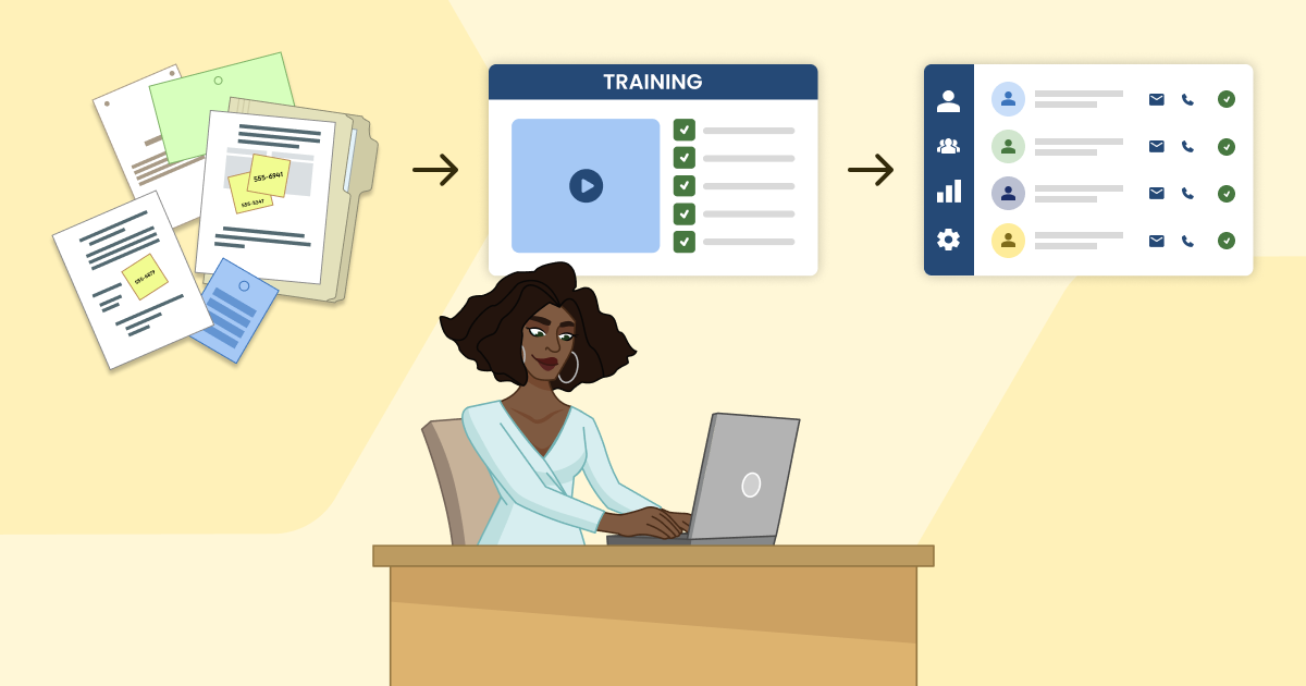
Train the People Who Create Content
Accessibility isn’t just for the IT department. Anyone who creates content such as web pages, social posts, handouts, or training modules should consider accessibility.
You don’t need a full course to get started. A short internal workshop on writing good alt text, another on choosing readable fonts and colors, and a simple “before you publish” checklist for training creators can be really helpful. The goal is to make accessibility part of your everyday process.
Get Curious About Assistive Technology
A little curiosity can unlock a lot of insight.
If you’ve never done it, try turning on a screen reader and navigating your homepage. Try going through a training you created using only the keyboard. Turn on captions by default for a week and notice how it changes the way you interact with video.
TIP: If you’re not sure how to turn on a screen reader, do a quick Internet search on “how to turn on screen reader in [software/platform name]” to find instructions. It’s worth the time. This kind of small experiment helps you see your digital space through someone else’s eyes (or ears, or tools). And the perspective tends to stick with you in future decisions.
Report problems you encounter in 3rd-party tools
You may uncover an accessibility issue in a tool your organization relies on, such as a learning management system, productivity app, or another type of software. If that happens, you can follow these steps to report the problem clearly.
- Document what happened. What were you trying to do? What actually happened? What did you expect to happen instead?
- Provide clear steps to reproduce the issue. Include the exact page or feature, the steps you took, and what stopped working.
- Share helpful details (when you can). Include the browser and device, assistive technology used (screen reader name/version, keyboard-only navigation, voice control), and screenshots or a short screen recording.
- Ask for a remediation plan. Request confirmation that the vendor received the report, what they’ll do next, and a timeline for a fix (or a workaround while they work on it).
- Track it. Keep a simple log of what you reported and when you heard back, especially if the tool supports a public-facing service.
Where to Start
If all of this still feels like a lot, that’s completely understandable. But you don’t have to solve everything at once.
Here are three simple steps to get you started.
- Choose one meaningful improvement for your website.
Consider updating your homepage and a few key landing pages to improve color contrast and clearer headings. You might want to add that accessibility statement and feedback link. Pick something that touches many users and commit to making it better. - Choose one meaningful improvement for your training.
You might start by captioning your three most-used training videos. Or, you might add alt text to all the images in a core tutorial, or reorganize the lesson structure so it’s easier to navigate. You can tackle accessibility one step at a time. - Set aside some time to review your tools.
Talk with the person who manages your website and training platform. Ask some of the vendor questions outlined in the next section. Capture what you learn in a simple document: what’s working, what isn’t, and what you’d like to address first. You can use the document as a roadmap for meeting the new accessibility regulations.
What to Look For in a Training Platform
When you evaluate a training platform—whether you’re choosing a new one or double-checking what you have now—it’s important to ask how the platform supports WCAG 2.1 AA compliance. You want more than a generic “we’re accessible.” Here are five key features to look for:
1. Ability To Upload Captions
Why it’s important: People can choose to read what is being spoken, which is especially helpful for deaf and hard-of-hearing learners.
What you can do with Niche Academy: Auto-generated captions are helpful, but not perfect. With Niche Academy, you can use auto-generated or upload custom captions to take accessibility even further. We’ve recently added the capacity to support multiple languages through captions!
2. Ability To Upload Audio Tracks
Why it’s important: You can provide options for people who are visually impaired. Audio tracks generally align better with content than screen readers, making them extremely helpful for visually impaired learners or people with ADHD, dyslexia, or other reading challenges.
What you can do with Niche Academy: By uploading descriptive audio tracks, you can make video content useful to a broader range of people who would otherwise have trouble with the default video/audio. We support multiple languages here, too!
3. Easy-To-Use Headings
Why it’s important: Headings make all the difference in how screen readers interpret text—allowing users to scan content and jump to specific sections quickly. Your learners will thank you!
What you can do with Niche Academy: We have created a system that takes the stress away from you by automatically adapting the headings in user-generated content to fit our pages’ existing hierarchy.
4. Ability To Upload Video And Audio Transcripts
Why it’s important: Giving learners a choice in how they consume information can help with knowledge retention—and underscores your commitment to their learning. Many younger learners were raised with closed captioning on their televisions and prefer this way of engaging with materials.
What you can do with Niche Academy: In addition to captions or alternative audio tracks, Niche Academy has a section to upload transcripts. This option requires less technical expertise compared to uploading captions or audio files. A good transcript should ensure that someone reading it or listening via a screen reader will get as much of the full video experience as possible.
5. Ability To Adjust Color Contrast
Why it’s important: You can support learners who have color blindness. One in 12 men is deficient, so the ability to adjust colors is important.
What you can do with Niche Academy: Academies can choose their own academy color, but it isn’t easy to know which colors will have enough contrast. We have simplified this by adding a backend check. This check runs when setting a new color in General settings, and will not allow academy colors that don’t meet the default WCAG 2.1 AA standards. This feature takes the guesswork out of selecting an academy color.
6. Clear Landmarking For Users
Why it’s important: By defining the structure of your content (using the correct H1, H2, etc.), you help assistive technologies (e.g., screen readers, OCR software) understand the page's layout and allow users to navigate to important sections of your page quickly.
What you can do with Niche Academy: Our platform is designed to make it clear to users where they are on the page and the purpose of each section.
To sum it up, Niche Academy is WCAG 2.1 compliant at an AA Level. This means we support things like tabbed navigation and speech recognition software. Our software engineer, Westyn, explains, “By helping content creators adopt a mindset of simplicity, many accessibility challenges are already handled by the platform itself, making the process less daunting for users. The platform handles most of the complex accessibility aspects, allowing users to focus on keeping content simple.”

Bringing It All Together
Accessibility isn’t about perfection. It’s about alignment.
It’s about aligning your values—equity, inclusion, service, the core of your organization, with your practices—how you design websites, write content, and deliver training—within the real constraints you’re working under: limited time, staff, and budget.
The new ADA rules raise the legal stakes, but they also make expectations clearer. For many public entities, something like WCAG 2.1 AA is no longer just a “nice to have”; it’s the baseline. That can feel intimidating, but it also gives you a north star to work toward.
The encouraging part is that every step you take—adding captions, improving contrast, clarifying links, choosing a more accessible training platform—makes your digital spaces more usable and more welcoming for real people. It helps the patron using a screen reader at home, the volunteer learning on a borrowed laptop, the staff member squeezing training into a busy day, and the community member who’s never quite felt like the online world was built with them in mind.

.png)
.png)
.png)
.png)
.png)
.png)
.png)
.png)