Library UX: 3 Rules for A Beautiful Website On Any Budget
Three rules for a beautiful and effective website no matter what technology you're using or what your budget is.
Most of the patrons using the computers in your library and everyone who is connecting from outside the library will interact with your website. Given that fact, you want your website to be just as inviting as the physical space within your library. No matter what your website budget is or what your level of technical expertise, I'm going to suggest 3 rules you can follow to create a welcoming website experience. Whether you happen to be the person who works on your library website, or just someone who can recommend improvements, these 3 rules will give you useful guidance.
#1 The Rule of 5
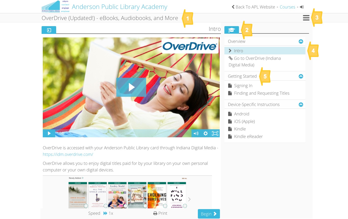
The Rule of 5 is simple. Look at your page and count the number of times you see a change in color or font (this includes font size and typeface). The Rule of 5 says that you should simplify your website until you only count 5 changes. Images (pictures, photos, logos...) don't count towards your total. Simplifying your website in this way creates a clean, uncluttered, and easy to comprehend space in which your images can receive the attention they merit. Consider how the Rule of 5 is applied in the Niche Academy full-screen tutorial view:

This page has 2 fonts and 3 colors. There is a large font for the heading (1) and a smaller font for all other text (5). There is a dark blue for buttons, tabs and controls (2), a dark gray for lines, separators, icons, and text (3), and a light blue for highlighting (4).
The rule of 5 forces you to use space and organization to create meaning. It gives the page the feeling that everything belongs together, rather than being a box of collected oddities. It forces you to see the page as a whole, the way that people experience it when they see it for the first time. It forces you to think like someone who doesn't already know where to find what they're looking for. And this leads to the second rule...
#2 Choose an audience and a message.
Every page of a website, especially the home page, should have a specific audience in mind and a clear message for that audience. "Hey commuters, we have audiobooks", or "Hey moms, we have activities for early childhood education", for example. Now, the website home page message can (and probably should) change its audience and its message often. But too many library web pages try to present something for everyone with the effect that there's no clear message for anyone. Keep in mind that we move through a world bombarded by messages intended for someone else. We're used to it. When someone visits a library home page and sees a message for a group they don't belong to, they won't usually say "Humph, I guess the library isn't for me". They will simply look for navigation to the stuff that is for them. With a simplified and purposefully organized website (see the Rule of 5 above), the navigation won't be hard to find. Consider the Anderson Public Library Website.
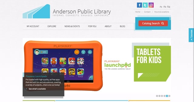
The home page that you see in a typically sized desktop browser shows a clear set of navigation options and one specific message for one specific audience. The message is set up in a "carousel" so it changes every few seconds and rotates through a set of 6 different messages. This approach forces the library to select a few things to highlight but it ensures that they will actually connect and communicate with someone. This leads directly to the last rule, which is really just an exension of this one.
#3 Market, don't just provide access.
Through nearly all of the last century, libraries served their purpose by organizing information resources and facilitating access. In a world with an Internet, though, information is no longer scarce and most of the general public is unaware of the range of specialized resources libraries offer. These realities require that libraries not just provide access to resources, they need to curate access to locally relevant resources and communicate the value of those resources to patrons. Resources must be presented as solutions to specific patron problems, as appealing answers to specific needs. Libraries must, in other words, "market" their resources. A page with a long list of resources will serve to provide access, but somewhere there needs to be an effort to highlight specific things to specific people. Consider the Greenwich Library website, for example.
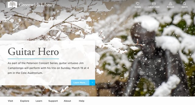
The seasonal background image suggests a chilly early Spring context against which a cozy evening of virtuoso guitar music sounds appealing. More than just announcing the event or listing it on a calendar, they are highlighting a value proposition. Here is a delightful way to spend a Sunday evening. It speaks to an audience they know and want to connect with.
You may face real limitations with your library website, it may be running on a very old content management system, it may not be mobile responsive, it may be part of your city website... If you have any influence over what's displayed there, though, you will surely benefit by moving closer to the Rule of 5, choosing an audience and a message, and by marketing, not just providing access.
.png)
.png)
.png)
.png)
.png)
.png)
.png)
.png)