Library Marketing
Libraries Using Niche Academy in their Websites
A sample of libraries using Niche Academy as part of their own library education and library marketing plan.
Library marketing, and library resource promotion made easy. Simple steps and an introduction to some free and highly effective tools.
I should start out by telling you that I'm not a graphic designer or an artist of any kind. I'm not a trained marketer either. I have an MA not an MBA or an MFA. I don't know much about color theory and mostly wouldn't recognize a golden mean ratio unless you pointed it out to me. So why am I, of all people, proposing to tell you something about beautiful library marketing?
Simply this--I've found some tricks that have let me create some fairly effective library marketing material. So if I can do it, you should conclude, certainly you can too. Read on and judge for yourself.
To keep this simple, I'm going to organize my tricks as 5 sequential steps.
Your goal is to increase the visibility and the utilization of something the library has to offer. Maybe it's a library class or program, maybe it's an electronic resource. Whatever it is, your library offering isn't going to speak for itself. Without effective library marketing, most people just won't know about or see the value in what the library offers. And tell me you don't see that scenario all too often. I do.
So the first step is to simply choose one thing you want to promote. In marketing terms, your library has a "brand". It is the sum of the feelings, ideas, and impressions your patrons (customers in marketing terms) have about the library. When you deliberately set out to market a library resource, you are helping to shape your library brand.

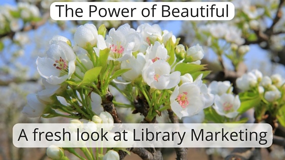
Find an image that is in some way related to the resource you want to promote. This relationship to the resource doesn't have to be very strong. If it's an electronic resource, having a computing device somewhere in the picture, for example, may be sufficient. What matters much more, is that the image be beautiful. It needs to somehow trigger a positive emotional response. My own taste inclines towards images that feature warm natural light. Pay attention to your audience, though, and let their responses be your guide to what's beautiful.
The really good news is that there are a lot of great places to find beautiful pictures online. Here are just a handful of some of the great places to look--note that all of the ones listed here are free.
My favorite tool for this step and the next one is Canva.com. Canva is a free online graphic design tool. It lets you upload your own images to include in a design as well as offering over a million stock photos that you can download for $1 each under a single use licenses.
Whenever you create a new design in Canva, the first step is to choose a height and width. They have a number of standard sizes available to choose from including standard paper sizes and the optimal dimensions for Facebook, Twitter, Instagram, and Pinterest. When you set height and width specifically for a given context, you ensure that your image won't get clipped or distorted in ways you don't like.

When you download a design you've created in Canva, Canva also makes sure that the file size (in bytes) of your image is not too large. This saves you from posting an image to your website, for example, that will make the page slow because it takes so long to load your huge image. This is a very common problem for novice graphic designers like myself.
A beautiful image will attract attention. A bit of added text will direct that attention where you really want it. In as few words as possible, you want to accomplish two things:
Size and place your text with the image so that it doesn't detract from the attention grabbing power of your image. To make the text easy to read, you may want to place a solid color or semi-transparent background shape behind the text. Here, again, Canva shines because it makes this really easy to do.

Once you've gone to the trouble of creating an image and thinking of the text to go with it, use it again. If you sent an image as part of an email, post the same message on Facebook, find a place for it on your website, or put it on a tent card. You will, of course, want to size the image appropriately for each context where you use it. With a tool like Canva, though, this is a matter of a few minutes, not a total reinvention.
Recycling images in this way saves you time and has the added benefit of increasing recognition with your target audience. Seeing the same graphic in multiple contexts makes it more likely that your audience will remember the message and become interested enough to take action.
So there you have it. Nothing described above is difficult or expensive or impractical--just a few ideas, I hope, you'll find worth a try.

A sample of libraries using Niche Academy as part of their own library education and library marketing plan.
In this free one-hour webinar, Lauren Stara and Callan Bignoli explore library service design, what it is, and how it can make your changing library...
5 ways that Niche Academy tutorials provide a better user experience and are better aligned with library education and your library brand.